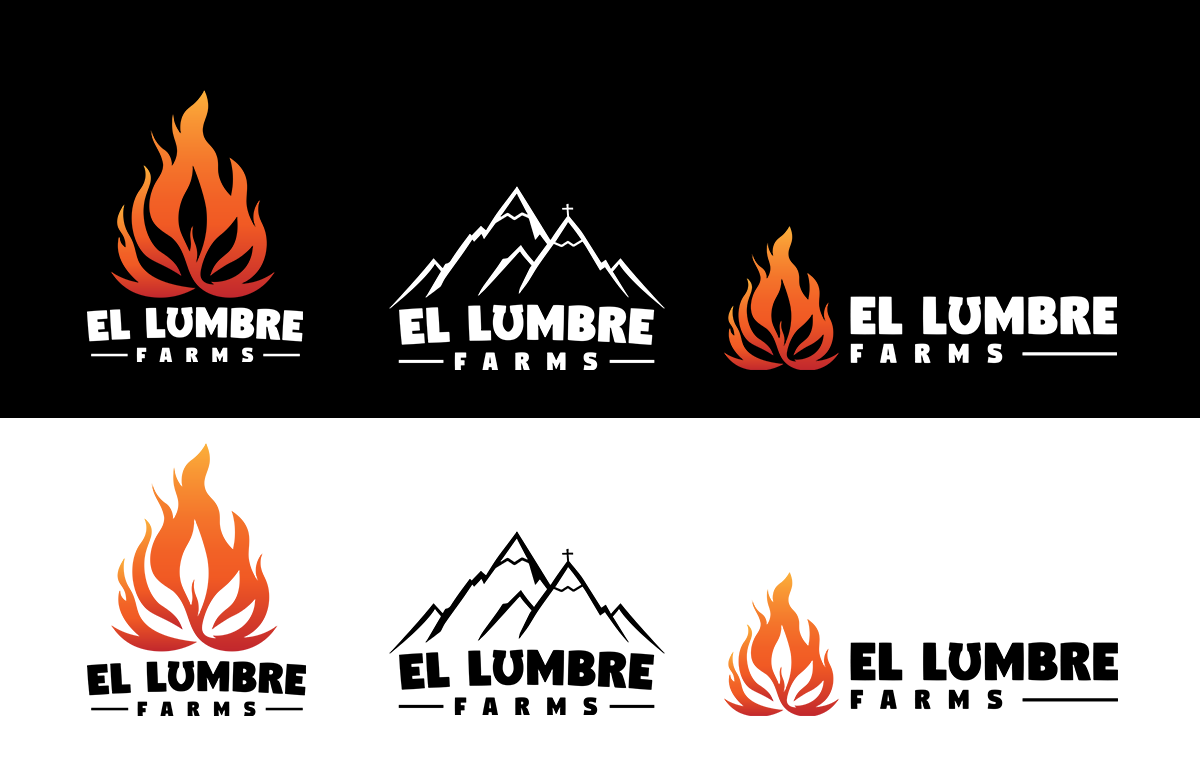
We partnered with El Lumbre to help them find a new brand identity and create a website around that. Our team revamped their main logo, created logos for 5 new strains, and built them a quality webflow website to match!

Their concerns with their current branding were that the design was too cluttered, and they wanted a simpler, clean logo to refresh the brand's image.
For their logo, improving meant that we simplified the design a bit by minimizing the number of colors and fine details included to make it more suitable for branding no matter the size of the logo on a photo or merchandise. Ideally, you want a logo to be recognizable at first glance, and the less busy the better.

We were careful not to take away the original design’s characteristics completely and decided to preserve a few key elements of the original design. As you can see we kept a similar design format, the idea of a cannabis leaf inside a flame, and the lucky horseshoe as the ‘U’ in ‘Lumbre’.
By reducing the logo’s complexity, it retains its visual appeal and legibility when scaled down, printed on different surfaces, or when placing a solid color overlay.
The clean lines and uncluttered composition grab your attention and create a lasting impression. This visual impact plays a crucial role in enhancing the overall branding and creating a positive perception of El Lumbre.
By utilizing open space, the leaf inside will stand out on any background. To further ensure visibility, we included white & black variations.
In order to have a more “clean” logo with no references, we created them this lovely mountainscape version to use on official documents.
El Lumbre Farms also asked us to design five unique logos for their different cannabis strains. We aimed to enhance the branding of each strain individually while maintaining a cohesive visual identity across the product line. To capture the essence of each strain, we carefully selected symbolism and imagery that aligned with their unique attributes.
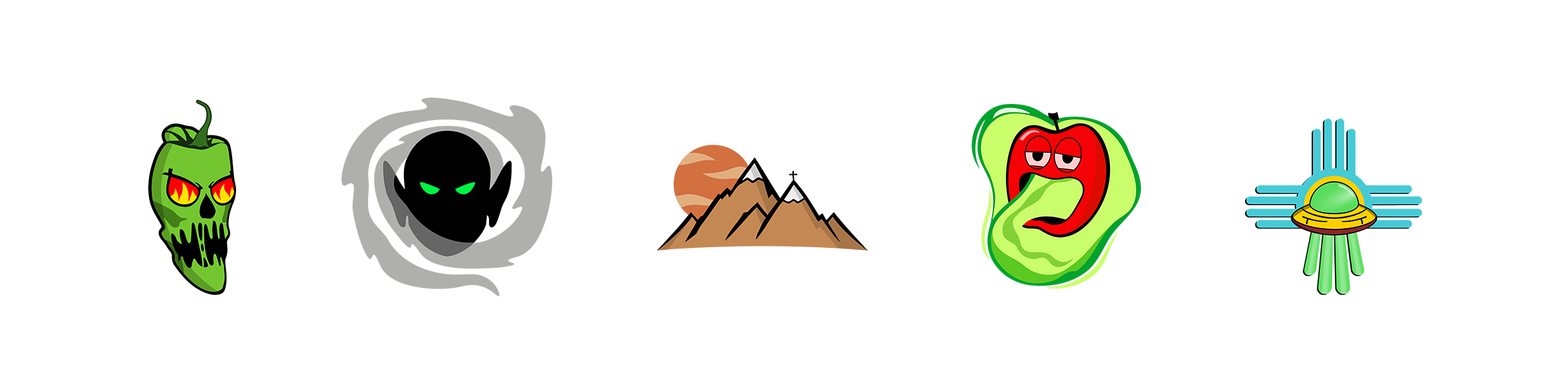
While each design was unique to the strain, we aimed to maintain a sense of cohesion across the graphics. We made sure to keep a similar art style and complementary colors throughout the set of logos. By doing this, it created visual harmony, tying each logo together under the overarching brand umbrella.
Although we were able to be more creative with these, we didn’t want to overwhelm each image with a ton of detail since it would allow for more packaging options/designs.
Throughout the process we were in consistent collaboration with El Lumbre Farms, gathering feedback and fine-tuning each design to their preferences. Together we were able to capture their vision for their brand.
We greatly appreciated the creative freedom we were given with this project and believe it’s what truly drove our success with El Lumbre Farms.
Lastly, we gathered all the branding and created a website that fit right in. Using our knowledge of webflow, we built a responsive, simple-to-use website featuring all their info.

.webp)